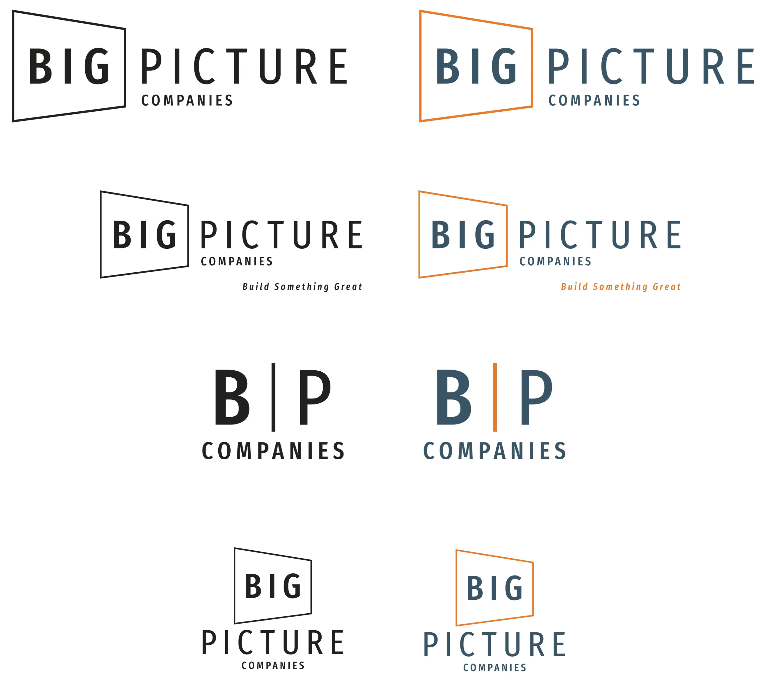
Big Picture Companies had become more than its old logo let on: a new name, a bigger business, and a twelve-year-old design that no longer fit. So we started where every identity should: the logo. We softened the old one into something cleaner and more professional, built around the client’s own palette of navy and fall tones.
From there, we built out the rest. The concept became a full brand system, forming an identity that carries into everything the business runs on – business cards, Teams backgrounds, a print brochure, a new tagline. A single, consistent look across every touchpoint.